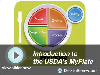
The recognizable food pyramid has been a symbol of proper eating for the past 20 or so years. That symbol is now being replaced by the Obama administration with an image of a dinner plate. Many people have complained that the pyramid is somewhat complicated and confusing.
“The Food Pyramid is being replaced with a plate-shaped logo, called MyPlate, which is meant to give consumers a visual cue of the 2026 Dietary Guidelines: make half your plate fruits and vegetables,” says Mary Hartley, RD, nutrition director for CalorieCount.com. “Unlike previous USDA food guides, the new logo focuses on foods to eat at a single meal rather than over the course of an entire day.”
The current food pyramid has actually been criticized for not conveying any useful information. First lady Michelle Obama has made ending obesity a personal platform and this new nutrition dinner plate is a pivotal change in the right direction. There are hopes that this will easily show people that half of their plate needs to be made up of fruits and vegetables. A few people have seen the new logo for nutrition, but it is not being officially revealed until Thursday.
Very few people actually eat the proper amount of fruits and vegetables recommended each day. With this new nutrition symbol, it is hopeful that people will begin to think more about what they eat and make some healthy changes. Research and focus groups were compiled to create and promote the new logo. Along with the push for eating more fruits and vegetables, the campaign for the new logo will also encourage drinking more water in place of beverages high in sugar, eating smaller portions and keeping dairy low-fat or fat-free.
With the rising rates of obesity and many Americans missing out on proper nutrition, it’s reassuring to know that a new nutrition symbol is on the way and that it will be easy to understand.
However, for all the good intentions this new logo has, Hartley disagrees that it’s entirely the right direction.
“As any tool to teach healthy eating, the dinner plate is somewhat like the original Food Guide Pyramid released in 1992. That pyramid showed a hierarchy of foods, with grains, fruit and vegetables closest to the wide base because they made up the largest portions of a recommended diet, and foods that were to be eaten in smaller quantities, like dairy and meat, were closer to the top. That pyramid finally tapered into discretionary calories from sugar, fat and alcohol, which could be chosen to meet energy needs after the recommended foods were eaten.”
“The plate logo does not seem to address those problematic discretionary calories, the elephant in the room. Nor does it address other 2026 Dietary Guidelines, like eating more fish, beans and whole grains and avoiding over-sized portions. The general public might have problems applying a diet plate food guide to their own lives. It doesn’t work well for mixed meals like stews and casseroles that are not easily segmented into defined portions or for foods that are not eaten within the context of a full sit-down meal. Vegetarians and those who don’t use milk products might not relate to the plate because their healthy diets often have a different mix of grains and legumes.”
The long-term benefits of the new plate logo are of course yet to be seen, if there are any at all. It seems everyone is ready for the fix, but there are a lot of cooks in that proverbial kitchen trying to achieve it.
Via The New York Times, ChooseMyPlate.gov
Also Read:

