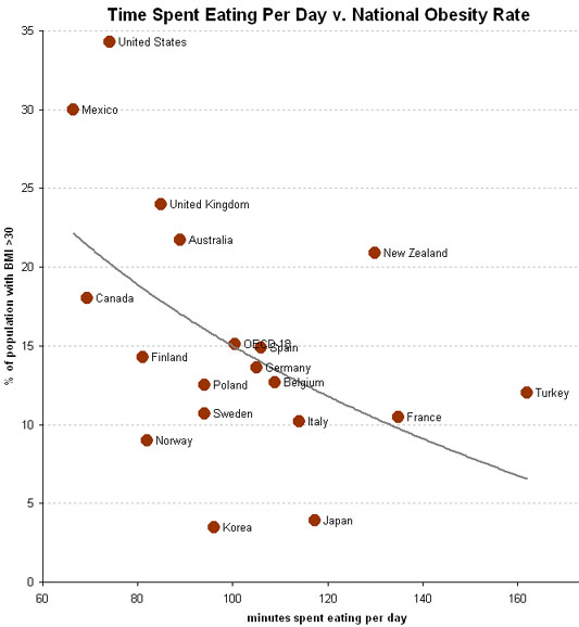
I’m not very good with charts. It’s one of the reasons that, when I got to calculus in college, I changed my coursework from Architecture to English. But even I can understand what this chart amounts to:
The chart plots out the relationship between the amount of time people take in the day to eat and their BMI (Body Mass Index). As can be expected, those countries that eat their food more quickly tend to be more obese. And as someone commented at psfk.com, those populations above the trend line tend to eat large land-based mammals (beef, pork, etc.) as their main protein source, and those under the trend line tend to eat mostly fish.
(Chart via Economix blog at the New York Times.)

