Cheryl Forberg, RD is a James Beard Award-winning chef, New York Times best-selling author, and nutritionist for NBC’s “The Biggest Loser.” Her latest book is “Flavor First,” which can find out more about at Flavorfirst.com. You can follow her on Twitter @cherylforbergrd.
Why were nutritionists so happy when the USDA announced the food pyramid was dead?
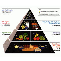
 When the USDA in 1992 released the food pyramid we’ve all become familiar with, many nutritionists voiced concerns with the diagram. The large base of bread, cereal and grains just gave the impression that you were supposed to eat so much more from that group. Encouraging people to eat so many grains and carbs, nutritionists argued, paved the road to an obesity epidemic.
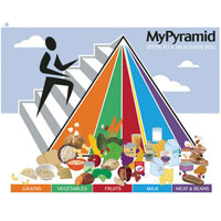
 The original pyramid had long been unpopular and in 2005 it was replaced with a new logo called MyPyramid, a nearly impenetrable glyph depicting a stick figure running up steps on the side of a vertical striped pyramid. Sensitive to fears that the hierarchy of the original could lead to an improper balance, the USDA abstracted the image and turned the breakdowns on their side. The running figure was meant to to remind people that exercise was an important component of proper diet and nutrition. Too bad nobody paid much attention to the essentially meaningless graphic.
Thursday, First Lady Michelle Obama, Agriculture Secretary Tom Vilsack and Surgeon General Regina Benjamin unveiled the USDA’s new food icon, replacing the confusing pyramid with MyPlate.
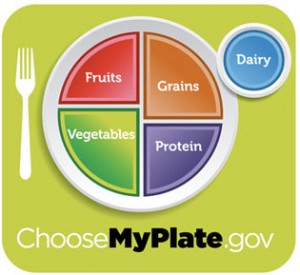
 “When it comes to eating, what’s more simple than a plate?” asked Michelle Obama when unveiling the new design. And it’s true, split plainly into four sections with a section for fruits and a separate section for vegetables taking up half the plate, it is easily understood.
USDA officials say that the new icon will be used to stress messages on healthy eating one at a time, with this first phase meant to encourage people to eat more fruits and vegetables in comparison to the amount of carbs and protein they eat. That message is loud and clear and welcome. One minor quibble, it would be nice if there were a place on the plate for good fat — a small place, but it’s important it to reinforce that some fat in a diet is beneficial.
The website, ChoosemyPlate.gov, will serve as the hub of a campaign centered around the MyPlate icon.
In its next stages the campaign will stress reducing portion size (“enjoy your food but eat less,” they say, echoing the sentiment of many an RD), and will encourage people to drink more water and stay away from sugary soft drinks. While I applaud the sentiment — eat your calories, don’t drink them is what I always tell clients and contestants on The Biggest Loser — it might be asking an awful lot of this new icon.
Along the side of the plate is a small circle for dairy, representing milk, yogurt or cheese (go for the low-fat versions), set as a glass would be. Of course there’s no super-sized colas or blended coffee drinks.
Sorry to mix metaphors, but getting rid of the food pyramid is really just the tip of the iceberg. A positive step, but just one.
All of these are good messages, and the first part of the campaign, encouraging Americans to eat more fruits and vegetables, is straight forward and easily understood. It’s important to look at your plate and see this sort of breakdown reflected, but it’s equally important to remember that your shopping cart should be filled in something like this ratio, and school lunches — which can come in boxes, compartmentalized containers and square trays — should also look similar to amounts suggested in the new icon.
Hopefully, with the help of education and dedicated nutrition professionals, rising obesity rates will be as much a thing of the past as the food pyramid.

